28 Ways To Interpret A Photo

On September 18th, I asked my fellow photographers to join me in an artistic experiment. I wanted to see how a single photo could be interpreted by different people, and to do this I presented the test-subjects audience with an unprocessed photograph and asked them to “Edit My Photo“.
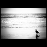
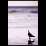
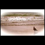
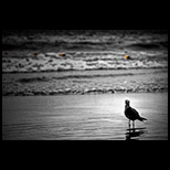
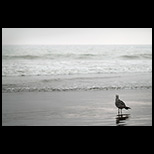
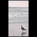
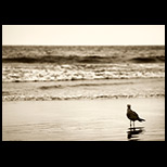
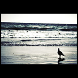
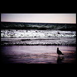
I knew that each participant would produce a different photo via post-processing, but how different was unknown. I must say that I'm shocked and amazed at the diversity and creativity of these results. The photographs on this page clearly show the boundless possibilities of artistic interpretation, and it all spawned from a single image.
Want more great projects, amazing photos, Photoshop tips, and articles on photography? Subscribe to Epic Edits today (free!) so you don't miss a thing.
Read below the images for more discussion of results AND for part 2 of this experiment — everybody's invited.


Before going any further, I'd like to sincerely thank all of the people who participated in this project so willingly and enthusiastically. Seriously gang, this wouldn't have happened without each and every one of you. Every photo on this page is an integral part of this project. And a huge thanks again to my Grandfather, Ron McCoy, who gave me this great idea for a project. Now… on with the discussion.
WHY DID I CHOOSE THIS IMAGE?
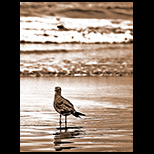
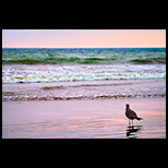
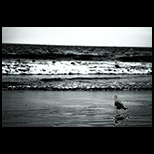
You may be asking yourself “Why the heck did this guy pick such a cruddy photo to run the project with?” Well, the image was completely intentional on my part. I literally have hundreds of unprocessed images in the “To-Do” pile, but this one presented unique opportunities for the project.
- Technical Flaws
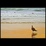
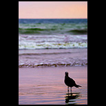
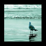
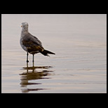
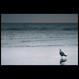
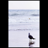
The horizon is crooked, there are dust spots, it's not perfectly exposed, and there are probably other things wrong with it too. I was curious to see how people would either “fix” these flaws, overlook them, or incorporate them into their final image. - Lack of Color
The image contains color — it's just not as vibrant as most of us would like to start with. I wanted to see how people would deal with this, and how color affects the mood of the image. - Foreign Objects
There's a string of buoys in the water, and I was interested in how people would deal with something that seemed out of place. - Simple Subject
The composition is so simple in this image that it opens itself up for a number of interpretations. The overall mood of the processed photo would be highly dependent on the participants.
So basically, I picked the image because it would present the project participants with many processing options. I also wanted to convey (with these results) that typically overlooked images may actually have some life in them — you just have to be creative and open your mind to “out of the box” options.
WHY ARE THE RESULTS SO AMAZING?
The photos above represent vastly different artistic styles, each of which is as unique as their creators. The combined effort is much greater than any one person would spend on a single photo, and the results are far more creative and diverse than any one person could achieve. Some of the participants are photographers who I've been following for some time now, and I can certainly see their artistic style showing through even though they didn't take the photo.
This experiment further affirms my own beliefs that photography is 50% capture, 50% processing. You may not hold the same views (I already know I'm going to hear about this comment from the “purists”), but you can't completely dismiss the power of post-processing. When it comes to the artistic side of photography, Photoshop and other similar software is a vital tool of expression.
The main reason I think these results are so amazing is because I gave no instructions or boundaries as to what to do with the original image, other than “process the photo until you're satisfied”. What I got back was a huge range of technique and style. Amazing.
WHAT CAN WE LEARN FROM THIS?
I've learned a lot watching this project take it's course, and I'm sure that the participants learned a few things too. But I think there are many key things that all of us can take away from this.
- There's More Than One Way to Process a Photo
In fact, there may be an infinite number of ways, you just have to seek them out and have the creative drive to try different Photoshop techniques. - Artistic Style Counts
Your own style can show through with post-processing just as much as it can in taking the photo. - It's Not the Software, It's the Artist
A ton of different software packages were used in these creations. Find something that works for you and develop your techniques. - Give Your Photos a Second Chance
Just because a photo initially looks unusable, doesn't mean it's not worth pursuing. A larger processing skillset will give you more options and allow you to use more of your images. - Art is Subjective, Beauty is in the Eye of the Beholder
Everybody has a different taste for art and photography. Don't be so quick to judge the work of others as “bad” just because it's different than you would have done it. Instead, study their work and try to understand what the artist has conveyed. Being less critical and judgmental will allow you to enjoy a much wider spectrum of art.
So study the photos presented here, explore the techniques that were used, ask yourself why you're drawn to certain images, and see if you can find an understanding of why the artist arrived where they did. There's a lot more to learn than I've listed here, but you'll have to find it yourself.
PARTICIPATE IN PART 2 OF THIS EXPERIMENT
Watching one image transform into multiple works of art has been absolutely amazing, but I'd like to take things a step further. What is it that makes certain works of art more appealing than others? Are there any patterns or consistencies to the more “popular” photos? To give us some insight to these questions, I need everybody's help again.
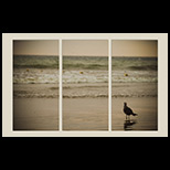
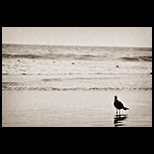
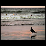
I want you to list your top 3 favorites from the images above. You can vote for up to 3, but no more — the results will be more interesting if you list 3, but you can also list 1 or 2. Each image is numbered from left to right, top to bottom. If you hover your mouse over an image, you should see the little text-tip pop up that shows the number and the artist's name. Vote by leaving a comment on this page with the numbers for your selections, and feel free to tell us what made you vote for them. I know there are a lot of them, but seriously try to view all of them at their higher resolution by following their links — there are a lot of subtleties that can't be seen in the thumbnails.
I tried to set this up with my usual poll plugin, but it didn't like the images very well. Besides, I think voting in the comments will work out better because we can vote for more than just one. So cast your votes now — I'll tally up the results and discuss my findings next Tuesday (10-23-07). Oh yeah, the most voted for artist will receive $50 in cash or giftcards (I'll let the winner decide).
Want more great projects, amazing photos, Photoshop tips, and articles on photography? Subscribe to Epic Edits today (free!) so you don't miss a thing.
UPDATE: The votes have been counted, and the winner announced. See the results from this project.
Cardelo
November 12, 2007I = 17
II = 3
III = 21
Lisa
November 14, 200716
27
28
annie
November 30, 20071. 7
2. 17
3. 20
I do find the pictures were helpful to give a better idea of how all this looks like, thanks for sharing your photos…
help
December 22, 2007this is a pretty cool social experiment and it’s definite proof that diversity in creativity is still alive and kicking!
Alan Cook
January 28, 2008My favourite is
1
3
23.
All are nice..though
The Dino
February 11, 2008I see it is late but I would vote 3,15,25
Louise
March 17, 2008I only see it now so I checked out the winner and even if it wasn’t my first choice I have to say that after second and third look it seems right
Amethyst
April 10, 200815
25
27
are my choices…
wowApic
July 14, 2008Brian,
Great post – a fantastic social experiment.
As you know we offer photo editing and touchup services for customers and we seem to have tackled this exact challenge of different perceptions/requirements when we do work for our customers – where we let the customer tell us exactly what he or she wants edited changed on their photos and it has worked out great.
We actually let our customers do both:
1. Tell us what exactly what they want
OR
2. Tell us to go ahead and be creative with their photos
So by leaving that choice to them at the very beginning – it has worked out great for our customers and for us.
Cheers,
http://www.wowApic.com
`ryoutsu
August 9, 200825
17
8
in that order 🙂
suzi
September 16, 20081,17,23 in that order
1 is the only one I would purchase if that states how far ahead of the others it is.
Brian Auer
September 17, 2008Thank you for the rant, I’m glad you got that off your chest.
jon
September 17, 2008What’s wrong with this experiment!
Clearly, the experiment was designed to make the conclusion “Photography is 50% capture and 50% post processing” seem right! Let me explain. . .
You started with a photo that has technical flaws, lacks color, etc. Definitely, the post processing will make the flaws disappear and make the photo more beautiful. Try starting with an already great photo. Will post processing improve it? Then the conclusion in this second experiment would be, that “Photography just doesn’t need post processing.” And, if the initial photo is already great in the first place, then, the way to analyze why it’s great must be in the technique (light, composition, etc)that it was captured.
Back to your experiment, why are the results amazing? It has nothing to do with the artistic or technical abilities of the post processors. . . the initial photo is just not good!
Regarding the winning photo in part 2 of your experiment, it’s the one that very obviously shows that the photo has been edited. People chose this because they are aware that they are choosing from among edited photos and the tryptich style just makes it stand out. It’s as if there was an additional step that the artist did that the others did not do. But, it’s not necessarily the best work!
Brian Auer
September 18, 2008I agree. Though I often shoot a particular scene with a certain intent, that intent may change once the post-processing begins. And it may change again if I revisit the photo several years down the road. I really don’t see what the big deal is with processing photos — to each their own, I guess. How is Photoshop any different than the traditional darkroom? How many people would call Ansel a hack just because he was very much into his darkroom activities?
Shutterhack
September 17, 2008I often take photos with loads of future plans for it to be presented. I take photo with the intention of having the widest possibilities for the photo to be processed. That is a highly skilled way to take a photograph, you’ll have to really know the vast types of media that your’ll be working on, ans the various types of situation and people your are going to present your work. And especially when one does photo journalistic type of photography, the sheer candidness it’s nature simply put a lot of constraint to the photographer in terms of time to think, to decide and all.
This (keeping the flexibility of my works ) I do so that I can present the same subject, issue or art to different type of viewers. I may change my view of my work in 10 year time and I might want it to be presented differently. We photographers, painters actors whatever our profession are, do change over times and situations and so does the viewer or the people who enjoy our works of journalism or art for that matter.
The common notion of assuming that people who process photos aren’t good photographers or they took a bad photo in the first place is in fact an extremely shallow perspective of the issue.
I too am glad to get this off my chest thank you, Brian.
Fadzly
Steve Brown
September 18, 2008Seems that this thread is having a renaissance one year on! Jon seems to have entirely misapprehended what the point of the exercise was. It never seemed to me to have anything to do with trying to “prove” an existing thesis about photography being x% this and y% that: it was merely an invitation to enthusiasts to apply their skill and imagination to a given image.
What I think these comments do show is the futility of trying to set up “rules” for creative endeavour, with the implication that following the rules is right, but breaking them is wrong. There’s no right or wrong here, there’s only more or less successful end product. If you take two pre-eminently famous photographers, Adams and Cartier-Bresson, it’s hard to imagine two more different routes to photographic success. In Adams there is painstaking planning and meticulous attention to technical detail; whilst with Cartier-Bresson we have the spontaneous capture of the “decisive moment” and no cropping or manipulation of any kind. Is one right and the other wrong? A totally pointless and meaningless question. Are both brilliant and inspiring photographers? Absolutely.
Brian Auer
September 18, 2008Well said Steve! I am glad that more people “get this” project than don’t. But, yeah, as long as photography exists, so will the debate between processing vs. no processing.
Shutterhack
September 18, 2008I’m glad Steve also have a more open view of the issue at hand. Blogs like Steve has here is a heaven sent to many new and promising photographers who wish to explore photography much further than merely taking brief snap shot, photographers who wish to take photography up to a higher level by for adding post processing as part of their work flow. Keeping an open mind like Steve has done is what we should all encourage.
Brian Auer
September 18, 2008Jon, it was a project — that’s it. The starting photo was chosen because it wasn’t perfect. One of the sub-motives for the project was to show that a sub-par photo can still be worked into a decent final product if you just allow yourself to get creative.
If we had started with the “perfect” photo, I’m willing to bet that we’d still end up with highly unique results. This project has been duplicated several times (with different starting photos) within the online photography community — two of those times I’ve participated in the processing.
https://www.leggnet.com/2008/01/calling-photoshoppers-results.html
https://www.cameraporn.net/2008/02/05/one-image-17-amazing-interpretations/
I’m thinking we’ll rerun this project soon, but I’ll allow participants to submit and vote on the starting photo. So when that happens, I’d encourage you to submit a photo that you think is “perfect” straight out of the camera.
jon
September 18, 2008I never said I’m against post-processing. I never said post-processing isn’t good. I never meant to bring out the issue about post-processing and no post-processing. All I said is that the experiment is flawed. . . and while everybody is thinking about styles and individuality, nobody dared to think about the validity of the conclusions supposedly drawn from this experiment. I rest my case.
Steve Brown
September 18, 2008Jon, you started your original post with, “Clearly, the experiment was designed to make the conclusion “Photography is 50% capture and 50% post processing” seem right! Let me explain. . .” Well, that is clearly your premise, but it isn’t in fact the stated or implicit aim of the exercise.
You then go on to claim that “nobody dared to think about the validity of the conclusions supposedly drawn from this experiment”. Once again, only you are drawing any conclusions, valid or otherwise. This has nothing to do with people not daring, it has to do with the fact that they don’t share your presuppositions. So your case, rested or not, is what’s really flawed here. 🙂
indir
December 17, 2008Seems that this thread is having a renaissance one year on! Jon seems to have entirely misapprehended what the point of the exercise was. It never seemed to me to have anything to do with trying to “prove” an existing thesis about photography being x% this and y% that: it was merely an invitation to enthusiasts to apply their skill and imagination to a given image.
Nancy
February 18, 200911 and 17 are my favourite ones. I really like he concept of posting these interpretations thanks.
Alex
March 3, 2009I like number 6 because of the real sunset feeling. The seagul is quiet, not even flying, and looking into infinity.
Also number 20 is very nice. It keeps the idea I expressed about no 6 and uses the widness to improve the view. Also the colors are brighter and more expressive here.
Thanks for the beautiful photos and tips.
Tony Lee
March 15, 2009Brian, what a great idea…it just proves that no two sets of eyes are the same. (And personal tastes as well.)
We conducted a similar experiment in one of my photography classes, with one difference. After viewing and choosing an image, we conducted the same experiment with the same images ONE WEEK later, under the same classroom conditions.
50% of us chose a different image! We concluded that "mood" could have played a part in our choices and perhaps has some control over our artistic expressions.
Thanks for sharing your interesting experiment!
Ajith Edassery
March 17, 2009What an amazing exercise… I particularly liked 16 (sepia) and 25 🙂 But when I take a look at them more, I tend to like other modifications as well.
Superb exercise…
Kev Jaques
April 12, 2009Hey Brian
Came across this old post from a keyword search on my site and this is a great idea, although the emphasis is on basic post work of the photo there are lots of other ways photos can be interpreted.
I often look at the natural detail of photographs, being able to pull things out of the photo such as shapes, faces, objects, colours that would not immediately be noticeable. Attention to detail is a must have when looking at photos such as this.
Great idea on the post work though, I would have liked to have seen a faux 3d version by shifting the image left and right, that would have brought out the perspective of the birds still but real stature in the water.
Blog bookmarked, now looking at newer posts 🙂
Cheers
Kev
George Packard
April 12, 2009I’m a bit late with my vote, but:
First: #17 I would consider framing this in a 3 column picture frame and would make a nice photo in any decor.
Second: #16 Here Mario isolates the subject, yet leaves an obvious background. Nice "portrait" framing.
Tkaniny Obiciowe
May 7, 2009I like #17. It completely changes the whole pic – it’s funny how such a small thing can change the whole picture.
Jessica S.
August 22, 2009Number 17
Number 16
Number 25
But it is really hard to choose.
Connie
October 15, 20091. 18
2. 2
3.
21
Connie