What Makes Some Photos More Popular?
On September 18th, I launched a project where I asked you to “Edit My Photo“. On October 16th, I posted the 28 entries received — which was phase 1 of this little artistic experiment. Now, phase 2 of the experiment has come to an end.
This portion of the project aims to evaluate what makes certain images more appealing to the general public. We had over 130 voters pick out their top three favorites, and comment on their reasoning. But before we get into the details…
HERE'S YOUR WINNER
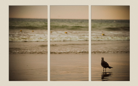
Congratulations to Felix Willeke for his “Virtual Triptych” interpretation of the image. The majority of his admirers commented on the effectiveness of the triptych for this particular photo. Some really liked the colors, and said it added to the mood of the image in conjunction with the split frames. While others didn't particularly favor the color scheme for one reason or another. In the end, I'm pretty certain that it was the triptych part of the photo that won the votes. Nice work Felix, you had a very creative and effective approach to this photo.
TIER 1 ENTRIES
Three other photos had a high number of votes, and one of them even took the lead several times. So here are the other top contenders.
In these photos, the colors seemed to play an important role in the voting process. I saw a lot of comments on these ones pertaining to the color schemes. I think one thing we can rule out as a common denominator is the crop — we've got one portrait, one landscape, and one square. Susheel's photo stood out for the kind of “retro” colors and the extra-soft background. Andrew's photo stood out because of the unique warm colors he used. Lau's photo stood out due to the cool tones, cold mood, and strong preservation of detail.
TIER 2 ENTRIES
Six other photos had a moderate amount of votes, and in fact four of them tied while the other two were only one vote off.
Conclusions are a little harder to draw on these selections. With several different color schemes, crops, level of realism, compositions, zooms, and level of detail, I think the main selling point on these images are the fact that they stand out in their unique approaches and attention to detail.
CAN WE DRAW ANY CONCLUSIONS?
It's hard to say. I think, in general, the creators of these top selections had an intent in mind when they processed the photo. It's that intent that drives us to “push” an image one way or the other. Sometimes the intent may not appear until half way through the post-process, but I think it's important for completion to occur.
Aside from the intent, most of these top photos stand out in one way or another — whether it be bold colors, high contrast, effective crop, exaggerated tilt, or some other pronounced feature. It doesn't appear that placement in the original list had much to do with the voting process, since these top photos were scattered about the top, middle, and bottom of the list.
If you participated in this project and your entry didn't make it into these “top” photos, don't feel too bad — every photo had at least a couple of votes, and I even received some votes via email. My goal here isn't to make you feel lousy about your entry, it's to make mention of what worked for this particular photo so that we can all learn from it. Keep in mind that what works for this photo won't necessarily work for another photo, but there may be some key elements that you can take away from this.
What other similarities or consistencies do you see in these photos that makes them stand out from the rest?
FW
October 26, 2007Thanks to Brian for a really great project, but first of all: thanks to those who voted for my interpretation.
Prints for your living room walls will go on sale soon 🙂
Looking forward to participating in the next project on epicedits.com or elsewhere!
Best regards,
Felix
Martin Gommel
October 26, 2007Congrats, Felix ! You are a worthy winner !!!
Niels Henriksen
October 26, 2007Brian:
I believe the selection of photo people to experiment to be actually an exceptional choice because it doesn’t have today’s Pop-in-your-face appeal but at closer look lacks real substance.
I unfortunately find on many of the photo critique sites, a trend, that if a photo doesn’t immediately jump or scream at you with the WOW factor that it is disregarded as being boring.
This doesn’t mean I don’t enjoy these images, but except for a commercial pop art appeal they, in many cases, do not have the staying power to last years on my wall or a gallery.
Many of the fine art images from renowned photographers would in many cases on these sites receive no or in some cases negative critiques.
A great photograph in my opinion and with many gallery owners or directors at first look may not appear as a great photograph. It is only by examining the whole of the image that we come to understand more about the context and begin to appreciate it for its true value.
I have on occasion, only because I can’t use the images of the greats, entered my award winning B&W images to these sites only to receive no or negative comments because it doesn’t initially pop or match perfectly with the standard compositional rules. To be fair it is harder to judge a reduced web image compared to a well printed n 8×10 or larger version.
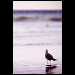
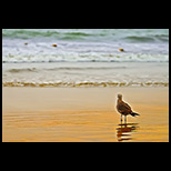
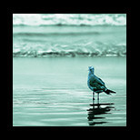
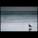
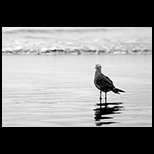
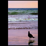
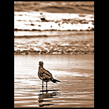
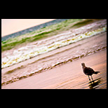
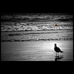
That is the reason I liked the choice of the seagull image and the good adaptations performed by many of the people here as these made me want to take the time to explore the images.
Thanks to all
Niels Henriksen
Brian Auer
October 26, 2007I know what you mean about that “In Your Face” appeal. I too enjoy looking at them, but I get frustrated when so many people overlook the more subtle works.
I have a hard time accepting critiques because of what you’re talking about. Your comment reminded me of a funny article called “Great Photographers on the Internet“. It’s so stinking funny because it’s true.
So far, I’ve only seen one good source for critiques: The Daily Critique from the Radiant Vista. These guys know how to do it right, and I have a lot of respect for Craig Tanner’s critiques.
libeco
October 26, 2007This just shows what a fun and nice project this is. The winning edit doesn’t appeal to me at all. So many different people, so many different opinions. I think this project is a success, I hope you’ll do more of them Brian!
susheel
October 26, 2007Brian,
I think that this was a great project. I loved the chance to be able to work on an image that was not mine and bring in and interpretation that was not the photographer’s.
I’ve deliberately stayed out of posting comments on most of the associated post (unfortunately not all) but I want to take this opportunity to tell you how great it’s been to see this project progress…
Look forward to more.
Susheel
Brian Auer
October 26, 2007LOL Felix. I thought it was quite interesting how many people made the same “hang it on my wall” comment.
I’m planning on launching another project in about a week or two, so I hope to see you participate in that one too!
Brian Auer
October 26, 2007I’m glad that you (and many of the other participants) found this project to be fun and interesting. I’ve got an idea for a similar project down the road.
Brian Auer
October 26, 2007It’s certainly been a blast, especially for me. I probably look at this project a little differently than everybody else — it’s really interesting seeing my own photo take on so many foreign transformations. It’s very enlightening.
libeco
October 27, 2007Perhaps you should make this amonthly contest or something like that. I don’t know about the others, but I couldn’t care less abou prizes, it’s just for fun for me…
Or perhaps every month another picture by another visitor of your site?
Brian Auer
October 27, 2007I don’t know about every month, but I was definitely thinking of having you guys submit photos and vote on the one you want to process. Then do the processing on that photo. The problem with doing it every month is two things: lots of time and energy, and it might lose it’s magic. But if there are enough people that would want to do it every month, we could probably work something out. Maybe I could find a project-master to help me run and organize the projects. I’ll try to address these things in an upcoming post (maybe Wednesday) to find out what the masses say.
buggslife
September 24, 2008I found this a very interesting study, however, some of the outcomes really disappointed. Of course art is subjective and opinions will always vary. My opinion is usually that you should work with a photo rather than against it.
Of the winners I agree with some of the top choices including the winner 17 and also 11 & 1, but I am suprised that versions like 6 and 22 appeared. Although 6 has a nice composition, to me it is just abusing digital post processing – pushing colour saturations. I guess art is evolving from the technology.
Personally I would have gone for the following in this order:
23
24
1
I feel that, having taken the shot as is, these make the most of what was captured.
P.S. I’m guessing nobody is really reading this seeing as it closed so long ago but I’d be interested to know any of your thoughts…
jeremy
May 22, 2009I’m late to the party here. I only just found this topic. I looked through the various entries and there was only one which leapt off the screen so I was pleased to see that it turned out to be the winner after all!
I like this kind of lateral thinking. If you look at the triptych, each section has a rule of thirds thing within.
The ones which were cropped didn’t work for me as the composition in the original works better. Some I feel monkeyed with it just because they could, with odd angles and colours, but only detracted from the picture, proving that less is often more.