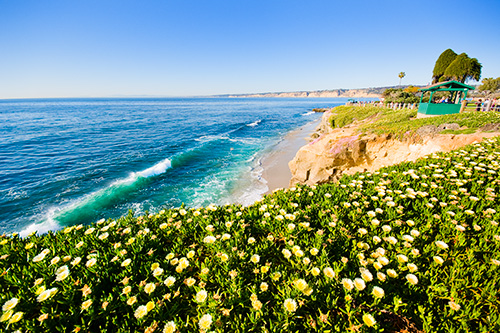
Field of Yellow

[Print Pricing] [Contact for Signed Prints] [See it at Flickr]
This one was taken along the shores of La Jolla, California. I was out with my wife this weekend and we decided to take a short trip down the Pacific Coast Highway from Carlsbad to La Jolla. The shores of La Jolla are some of the most scenic in the area — lots of small cliffs and sandstone formations, caves, vegetation, tide pools, etc. I shot this scene with my Sigma 10-20mm lens at the widest focal length of 10mm. I've been ignoring that lens for a while, so I put it on the camera and left it there all day… well, I had my film camera with me too so I wasn't completely limited on focal length.
- Unprocessed RAW
Here's what the unprocessed RAW image looked like — pretty dull and a little washed out. - Processed RAW
I cooled the white balance slightly, increased the contrast, increased the vibrance and saturation, and added a few other minor tweaks to the exposure settings. - LAB Saturation
I used my LAB Saturation Photoshop Action to bring the colors out a little better. This helped to remove some of the muddy haze in the sky. - Dodge
Selective dodging around the green of the waves and on the left side of the flowers at the bottom of the frame. - Burn
Selective burning in the sky and on the right side of the flowers to add more balance.
Enjoy!

Sam
May 9, 2008It’s a matter of taste, but I think you’ve overdone the greens a little.
Brian Auer
May 9, 2008Probably a little — they are a bit strong compared to the blues. But when I do color, I like to really do it. If you look at the unprocessed raw image, the greens are still much stronger than the other parts of the photo. Also, prints usually come out looking slightly less saturated than what you see on your monitor.
Jayde
May 14, 2008The colors definitely look a bit saturated, but I think it gives the photo a nice effect. This makes me remember something that’s always bugged me, I work off a laptop PC most of the time to process my images. When I print them, they always seem a bit more saturated and darker they appear on the screen. I always have to compensate for this between my print and web images, and it’s extra work I’d rather cut out of my work flow.
Do you have any tips on how to fix this problem? I know they are monitor calibrators out there, but how accurate are they with laptops?
Jayde
Brian Auer
May 14, 2008Monitor calibration is a fairly critical thing no matter what kind of monitor you’re using. You’ll find that your prints will look closer to what you wanted and it gives you the ability to get closer with softproofing.
One other thing to note is that most browsers will oversaturate colors. Save the image to your desktop and it will probably appear less saturated than here on the web page.
Sam
May 15, 2008Jayde, I had a similar problem, monitor calibration makes color casts go away, but in the end I bought a really good monitor for image work (Eizo CG19), and I do not regret it. Cobined with hardware calibration this is just a total different worl of image editing.