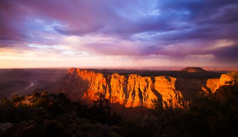
Colors of the Canyon
Here's one of my other photos I took the last time I was at the Grand Canyon — the other one I've shown is the “Sunset Flames“. This particular photo was taken minutes before the flames picture while the sun was still partly above the horizon. I thought it was interesting how the face of the cliff lit up the way it did. I was also pretty impressed with the clouds in the sky and the way they were reflecting the light and color.
- In-Camera JPEG
It actually looked alright, but I knew there was more color in those clouds. - Processed RAW
Warmed it up a bit, brought back the color in the sky, and I opted for less contrast to start with. I also cropped out some of the foreground and put the horizon right in the middle of the frame. Good idea? Bad Idea? What do you think? - B&W Conversion
I've heard this mentioned a few times, so I thought I'd try it out. I converted to B&W using an adjustment layer with the intent of processing the photo for tone and contrast before bringing the color back in. - Overall Curves Adjustment
Just a typical “S” curve for more contrast. - Targeted Curves Adjustment
I pulled the curve down and to the right to darken the photo. Then I masked out the lower half of the photo so it would only have an effect on the sky. - Remove B&W Conversion
Since I used an adjustment layer, I just turned it off. - Dodging and Burning
I did a bunch of little adjustments by dodging and burning various places throughout the image. - Sharpening
Unsharp Mask at 90%, 1.5 pixels, and a threshold of 1.
** You can also see this photo on Flickr and Zooomr **
Photo by Brian Auer
07/13/07 Grand Canyon
Colors of the Canyon
Konica Minolta Maxxum 7D
Sigma 10-20mm f/4-5.6 EX DC HSM
15mm equiv * f/4 * 1/45s * ISO100

Jim Goldstein
November 2, 2007Brian great lighting. The color throughout the image is really attractive. I particularly like the purple in the clouds in the background. The yellowish red cliffs contrast nicely against the purple clouds in the background. The complimentary colors really add impact. Next up you’ll need to experiment with a graduated neutral density filter to pull a little more detail out of the shadowed foreground. If you wanted to you could pull detail out of the shadows digitally, but the results can be hit or miss depending on how you approach it.
Brian Auer
November 2, 2007Thanks Jim. I just noticed… the foreground appears much darker in the web browser than it does in Photoshop. I actually darkened the foreground a bit because it was drawing too much attention from the mid and backgrounds, but it looks overkill on the web. I may have to go back and try one with a brighter foreground to see what kind of effect it has — it might actually be more appealing.
libeco
November 2, 2007I still haven’t decided, it’s a beautiful picture for sure, but I’m in doubt about the foreground. On one hand now the focus of my eye is on the colored area, but on the other hand it just seems way too dark. Maybe cropping more from the bottom could help? And somehow the horizon looks tilted, but maybe it’s just slight hills on the left. Oveall the scene looks fantastic!
Brian Auer
November 2, 2007The horizon is tough in this one. It looked tilted no matter how I rotated it. The horizon isn’t perfectly straight and the shadows from the sunset give false impressions of where the sky starts. I’ll probably fidget with this one some more, so maybe I’ll find a happy place for the rotation.