Graffiti Artists
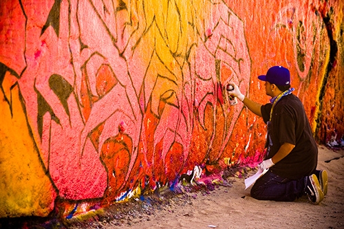
I've been so tied up with film lately, so I wanted to take a look back at a digital photo that had quite a bit of post-processing done to it. This photo was taken at the graffiti walls in Venice Beach, California. I've always been attracted to graffiti as an art form, and being able to capture one of these artists at work was a treat. This area is designated for graffiti artists, so there's no vandalism happening here.

I wanted this image to really pop with color and intensity, while having an “edgy” look to enhance the mood. The photo was shot in RAW and processed entirely through the Adobe Camera Raw software (so no Photoshop). Here's the process:
- Unprocessed RAW
The RAW file looks pretty bad. It's too cold, the contrast sucks, and the colors are dull. - White Balance
First things first, I corrected the white balance issue. The camera was set to “Auto WB”, but it made a really bad decision. So I bumped the temperature from 5500 to 7500 and the tint from +3 to +10 by setting the image to the “Shade” preset (since this was taken in the shade). - Exposure
I set the exposure to -.20, recovery to 36, fill light to 24, blacks to 17, brightness to +59, and contrast to +34. Not a huge change in the appearance of the photo, but it got my tones and histogram where I wanted them. - Saturation
I set the clarity to +85, vibrance to +33, and saturation to +11. Again, not a huge difference in the appearance of the photo, but these changes would be amplified in the next step. - Curves
I set the point curve to “strong contrast” and the values of the parametric curve as: highlights +32, lights +43, darks -49, and shadows -8. This really super-saturated the image and boosted the contrast way up. This wasn't a linear one shot adjustment either — there was a lot of back and forth between the curves and the exposure/saturation values. - Vignette
I added some lens vignette with an amount of -75 and a midpoint of 60. This darkened the near and far edges while toning down the super-saturation — which helps to draw attention to the center portion of the photo.
This may be a bit extreme for your tastes, but I wanted to push the photo until it was alive with color.
the_wolf_brigade
August 21, 2008Despite my film obsession, I actually found myself missing this section, cruising through some of your archives.
It’s interesting how digital shots can be pulled back from such drab beginnings into such a great feeling shot.
Bo
August 21, 2008I do love graffiti and the artists, too. Great capture.
And as a photographer with a lot to learn, I so appreciate these posts. Noting each individual step is such a great teaching tool. Thanks.
TigerTom
September 15, 2008Grafitti can sometimes look nice. I just don’t to live anywhere it’s a common sight.
African Parrot
December 29, 2008The colours definately look very vibrant, definately an improve from the original