February Challenge Recap
The February “Colors” Challenge is officially done and over. This was a really neat project because it made me focus on a specific color as the main subject rather than just some object, person, or scene. Each color has its different quirks, both in capturing and post-processing, so it was good to explore those things and learn about them.
My biggest benefit from participating in the February Challenge is that it's given me a new appreciation for black & white. After a week or two of shooting and processing nothing but color, I started getting really frustrated that I couldn't turn some of the photos black & white. Luckily we had a photowalk in the middle of the month, so I really cranked out the black & white photos from that. I think I'd probably feel the same about color if I were forced to shoot nothing but black & white — I need both to be satisfied.
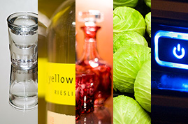
Here are my photos from the entire challenge:
CLEAR


Clear was kind of fun and challenging. I guess most people wouldn't consider it a color, but we tend to speak of it as if it were. In my first shot, I was going for the wild color display since clear takes on whatever color happens to be behind it. In the next two shots, I wanted to capture more of a traditional clear “color” by removing anything colorful from the surroundings. After finishing the whole project, I've got to say that clear was the most difficult color to capture — so I'm glad the first week was a short one!
YELLOW
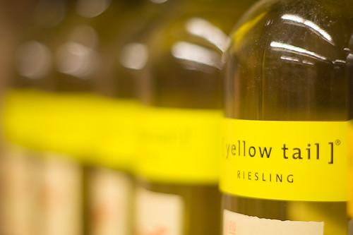


Yellow was also a fussy color to deal with. There aren't a lot of things out there that are yellow, and the things that are yellow tend to be somewhere between green and orange. I get the feeling that nobody can agree on what yellow looks like. The Legos I shot for the Tonka Truck picture were from several different sets. Not only was yellow the least available color of all the blocks, but each brand had a different yellow.
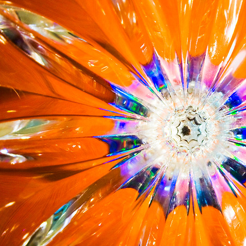
RED
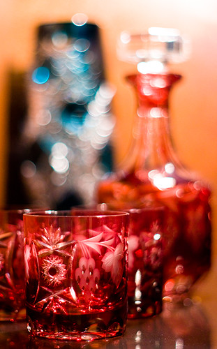


After picking two slightly difficult colors, I decided to go with something a little more friendly. Red was kind of fun to shoot, and it seemed to be more readily available than yellow. One lesson I did learn about red is that the tail lights in traffic are far less bright than the headlights. My long exposure traffic shot barely registers the red lights, and there was about the same amount of traffic on either side of the road. If somebody knows the secret to getting the tail lights to stand out more in these types of shots, I'm all ears.
GREEN
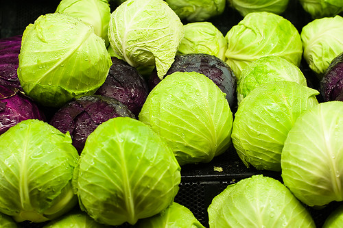


I was initially going to avoid green because it's the most abundant color out there. I gave in though — I couldn't keep passing up all that green just for the sake of being stubborn. One good place I found to shoot green: the produce section at the grocery store. I think the employees at the local grocery store are over me by now. I've been in there about a dozen times with my camera.
BLUE
I would have like to shoot more blue photos, but I just started winding down at the end of the green week. My goal was to shoot a photo every day, but I ended up missing one day during green. Then blue came along and I just kind of stopped picking up the camera. Oh well, too late now.
inspirationbit
March 6, 2008very well done, Brian. I can see that you had no trouble finding red things to shoot 🙂
How did you get those amazing blue/white dots behind the red decanter?
And did you touch up your Yellow Tail photo afterwards to get that perfect out of focus blurred yellow line of labels?
Brian Auer
March 6, 2008Thanks Vivien! And yes, red is certainly abundant when your grandfather’s house is completely filled with Chinese artifacts and decorations.
The blue/white dots or circles in that photo are a result of the lens bokeh. It’s something that’s caused by specular highlights when they’re severely out of focus and when the lens has a wide aperture. I shot it at f/1.4 and at a very close distance, so anything immediately behind the plane of focus is thrown out of focus very rapidly.
Same thing with the Yellow Tail bottles — It’s all due to the wide aperture of the lens. The only thing I post-processed for was some basic colors and contrast. The blur and perspective are things that were “placed” into the photo the instant I released the shutter. You can also see varying degrees of bokeh in that photo — as the bottles get further away, the circles caused by the light reflections get larger and larger.
This is why I’m so in love with that 50mm f/1.4 lens I just picked up — it can do really amazing things like this.
inspirationbit
March 6, 2008thanks for the answers, Brian. I will for sure be bugging you for advice (hope you won’t mind that much ;-)) on lenses/camera when I’ll finally decide on purchasing a professional SLR camera. With the recent move to a new house and renovations there as so many expenses, I keep postponing buying an expensive camera (and especially the lenses) for myself.
A u d e e
March 15, 2008Beautiful!!! I love the “red” shoot 😉 the blurry background and glass sparkles just make the main object speaks beautifully!