Grand Cayman Fuel Depot

[Project Announcement at CameraPorn.net] [See it at Flickr]
This week's photoblog is another special edition. The photo once again isn't mine, but it's one that I processed. Ryan Goodman ran a project asking his readers to revisit and retouch one of his photos. I'm a little late in getting around to doing the project, but the deadline is January 25 — so you still have a bit of time to get an entry in if you're interested in participating.
I wanted to give this one a go with black & white, and after checking the sky on the underexposed version of this image I knew I wanted it to be kind of dark and looming. So here's how I went about it.
![]()
To see the original files, check Ryan's project announcement page. The RAW files were all cropped and rotated as seen in my final output.
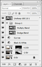
- 0 EV Base Layer
Processed in ACR for overall brightness, contrast, etc. This layer serves as a base layer to build upon. - -2 EV Composite Layer
Again, processed in ACR. I masked out the layer and “painted in” the areas I wanted to darken via the mask. Then I set the blending mode to Multiply in order to help darken things up even more. I darkened the sky heavily, and the water a moderate amount — leaving the rocks and the fuel depot alone. - +2 EV Composite Layer
Again, processed in ACR. Just like the previous layer, I masked out this layer and started “paining in” the areas I wanted to lighten via the mask. This one was all focused down in the water and rocks. Then I set the blending mode to Linear Light at 60% fill to add an interesting contrast look to the rocks. - Black and White Conversion
Photoshop CS3's Black and White adjustment layer set to “Red Filter”. - Curves Adjustment
Fairly strong “S” curve to bring out the contrast. - Contrast Layer Blends
Duplicated the output thus far twice. One layer was set to a Linear Dodge layer blend with 16% opacity and 70% fill (to lighten the highlights). The other layer was set to a Multiply layer blend at 10% opacity and 100% fill (to darken the shadows). - Sharpen
Unsharp mask at 100%, 2.0 pixels, and a threshold of 1.
Enjoy!
Antoine Khater
January 24, 2008I always struggle with my B&W conversions I found it much harder than colored pictues.
I know just about every technique out there but always take too much time comparing my various results. The right balance between the shadows and texture is hard to find
You did a great job here IMHO
My Camera World
January 24, 2008Antoine:
I actually think that since you struggle with B&W that you are doing good job but trying to understand what will work within your image.
In colour image we are fortunate that we have 2 types of contrast to play with to better enhance or isolate the subject. Colour contrast (Red-green, Blue Yellow, etc) and tonal contrast (dark light), whereas in B&W we only have one of these. But this can also be a benefit as then we may not have competing colour contrast that does not match the tonal contrast.
If you don’t mind a suggestion with B&W either print out the B&W image or leave open screen, but start marking out (with pen or a new layer in Photoshop) before you make any enhancement. Try and determine the following compositional elements if present.
1) Identify the main subject
2) Are there supporting elements that support the subject and visual flow (lines, triangles, curves, etc)?
3) What is the dominate high-contrast area in image as this is normally where the eye will go and does this support subject?
3) How does your vision move through the image?
4) Are there any distracting elements at edges or within image and these need to be softened?
5) How do you what the overall mood to be (dark and moody or high key)
6) Is there information in the extreme of the darks or lights that need to be preserved?
These may not all apply but if you first analyze your image in this manner, then it will be easier to make the changes and you now have a target model. If you look at my last blog entry you will see some of these elements in the decisions I made to create the B&W image. Not a perfect model but I hope it helps.
I also suggest that sometimes you work quickly and crudely (10-25min) on another version to test changes but don’t worry about masks edges and such. It is only meant to help with visual clues, before you spent too much times editing and then are unable to see the forest fort the tress.
Niels Henriksen
My Camera World
January 24, 2008Brian:
Of the 5 images I like your rendition the best. It captures the mood and we are able to see all the detail.
Niels
Antoine Khater
January 24, 2008Niels Thank you for that details explanantion I sure did need one 😀
Of course I do not mind !
You know what ? I think I will try it right away and see how it goes
Music Site
January 25, 2008Now that I call FANTASTIC,
it is wonderful, and the first one is the most beautiful, I enjoyed reading the details, I wish I have found your site long time ago, please I wish if you write some about how to improve the quality of pictures, I would love to read and learn,
Thank you very much for all this,
Regards.
CyberCarsten
January 27, 2008Again a great inspirational idea – I like the shot as it is already, so you have well choosen.
Dave Jackson
December 23, 2008We had no idea there would be so much to do on Grand Cayman. There is a lot of history, too. I was blown away that down in Bodden Town they have cannon off ships inverted in the ground to serve as posts for an entry way. The under the water is just as spectacular. I took tons of photos, but Brian… nothing like yours. Congrats!! Dave