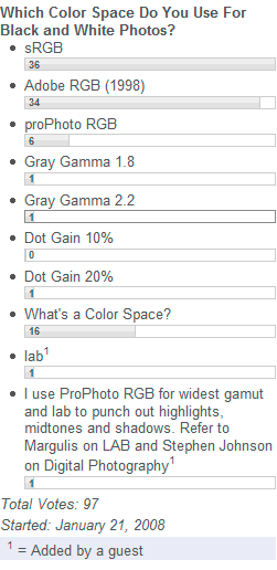
Which Color Space Do You Use for Black and White Photos?

As I fall deeper into the rabbit hole of fine art prints with ImageKind, something has come up that's really bothering me. Up to this point, I've been using Adobe RGB as my main working space for color management. Well, ImageKind has the ability to print true black and white photos if the image is managed under a grayscale color space.
Unfortunately, I can't find any good resources that speak to grayscale spaces because everything seems to be centered around the battles between sRGB, Adobe RGB, and proPhoto RGB. Now surely there must be advantages and tradeoffs between the grayscale color spaces, but I'm somewhat unaware of them. So I'm curious what you folks use for your black and white photos. I'd also greatly appreciate any further information or links to information on this subject. And if you do use them, do you work in that space or do you just save the output files down into grayscale.
And on a different topic within the subject of art, check out the results from the poll last week asking “What Would You Pay For Fine Art?” Clearly we couldn't come to a clear answer, but I do see a few points worth noting. It looks like you guys would fall into three categories as art buyers: the low-end ($50), the mid-range ($100), and the high-end ($300+). I'm sure we had some yahoos vote for the $300 option just to mess with the poll, but several people mentioned in the comments that they'd pay much higher than that if it was a worthy print. On average, the majority lies at about $100 — so keep this in mind if you ever think about selling your prints as art.
the_wolf_brigade
January 22, 2008I was seriously tempted to add the voting option “I’m not sure how this relates to film”, but I suspect I’d be in the minority….
However, having just ordered 2 gig of RAM for my laptop, I’m so close to actually being able to post process my digital stuff that I’m really considering starting to shoot RAW – in which case I need to find out what a “colour space” is, so I voted “What’s a colo[u]r space”…
Chris
January 22, 2008Not something I’d thought about with regards to mono Brian; I did some research afer I got my 350D about 18 months ago and came to the conclusion that Adobe seemed the way to go when taking shots for printing and convert to sRGB for web use?
My Camera World
January 22, 2008All my B&W images originally start and stay as 16 bit aRGB. IT is only when I convert to web that I change to RGB.
I recommend that all photographers who are interested in printing larger prints that you keep the image that you work on in aRGB if available and 16 bit if you can. He 16 bit will take up more storage space.
Even if you are only displaying for web and printing a few 4×6 prints you never know when software and commercial printing vendors will be able to use the large format.
Even when an image starts as sRGB when you add layers to affect colour or saturation you will never know when these changes will exceed sRGB and easy to do and therefore will be clipped or other rendering depending on the settings you have to convert to sRGB.
For the most part a colour space is really a set of lookup tables that inform digital devices like monitors, printers how to interpret and display a RGB colour value.
aRGB space can display more colours than sRGB. PhotoPro can display more than both which are all less that what the real world can present.
Some of the newer printers can handle aRGB and 16 bit, which is really a benefit when you have light saturated colours with smooth tonal shifts. There will be less banding in a larger space when you work on an image.
The issue most photographers will face is trying to determine how to render(re-map) to an sRGB space. There is no one formulae for all images. It depends on whether you need all colours to be relative to each other or are there some colours that must remain absolute and any outside mapped downward.
Niels Henriksen
Antoine Khater
January 22, 2008Another vote for “What’s a color space” since I would really like to know more about these, I’ve only scratched the surface in this field
All I know is that I shoot RAW, edit is aRGB and convert to sRGB for web publishing because I have been told so
My Camera World
January 22, 2008Some follow up reading that you may find useful as many of these articles are very mathematical
Wikepedia
https://en.wikipedia.org/wiki/Color_space
Dry Creek Photo
https://www.drycreekphoto.com/Learn/color_spaces.htm
Colourmanagemet: Color space conversion
https://www.cambridgeincolour.com/tutorials/color-space-conversion.htm
Luminous Landscape understanding Photpro
https://www.luminous-landscape.com/tutorials/prophoto-rgb.shtml
Microsoft ¨ Color space and you
https://www.microsoft.com/windowsxp/using/digitalphotography/prophoto/colorspaces.mspx
Digital Outback Photo
https://www.outbackphoto.com/color_management/cm_06/essay.html
Niels Henrisken
Brian Auer
January 22, 2008Great discussion thus far, and a wonderful set of links Niels. I’m also on board with working in aRGB and converting to sRGB at the end for web output, but I’m still hung up on what to do with printing b/w images on a printer that can recognize grayscale spaces.
My Camera World
January 22, 2008A lot of printers use all the colour pigments to produce tones of black that is why in many B&Ws there can be a slight tint.
The higher end printers will have 2 or 3 tones of black ink and these produce good results.
Since I work in Photoshop I let Photoshop mange the color or lack of color when printing. It is only my sRGB images I convert to greyscale which I do not print.
If you are serious about printing B&W then I recommend the following book which I have read.
The book does not really deal with creating B&W images (ie photoshop) but goes into great amount detail about the process of creating B&W images from input control to printing on printers setup with only various black and grey inks.
For black inks there are sometimes 2 types, one for a gloss type paper or matt type papers. The gloss black will flake of on a matt type paper.
Mastering Digital Black and White, by Amadou Diallo
Geoffrey Wittig wrote an excellent book review over a the Online Photographer.
https://theonlinephotographer.typepad.com/the_online_photographer/2007/12/mastering-digit.html
Niels Henriksen
My Camera World
January 22, 2008The book title was left off above because it was a link.
Mastering Digital Black and White, by Amadou Diallo
Niels
Brian Auer
January 22, 2008Thanks Niels, this is exactly what I’m getting at. The printers I’m using have different print profiles for b/w versus color photos. Here’s an excerpt from an email I received from ImageKind regarding their print capabilities:
Selecting a default grayscale colorspace is again, a rather subjective decision you need to make. The important issues rather, are that you be sure to (a.) calibrate your display device and (b.) always include color space information for whichever profile you use, with your images. I personally have my colorspace set to dot gain 20% as my default and am happy with it. As long as you follow (a.) & (b.) above, Imageprint (our RIP software) will properly translate the data and print the images as you see them. The grayscale profiles that I mentioned are great because they better utilize the black inks on an Epson and do not rely on other colors to create the grays found in a B/W image.
My Camera World
January 22, 2008Imagekind has moved their printing plant to Portland so I am unable to phone the actual printers.
The last time I phoned about papers they used and profiles I was able to get alot of information from them. The printers seemdd very knowledgeable about all aspects form hardware to profiles.
I have asked a question whether they have dedicated B&W printers only and they will try and call me back.
The one concern I have with the above comment while they recommend 20% dot gain the have not stated the B&W profile or gama settings.
He or she references profiles but I did not see this in his answer above
As I find out more I will post back here.
Niels
Chica
January 22, 2008I’ve never known about Color space.. the only time I make the images black and white, is if I choose to have a photo that way, I’ve never specifically taken a black and white photo, if that makes sense. Now you peaked my interest. 🙂
Brian Auer
January 22, 2008Well, I’m not taking black and white photos either — I’m shooting with Adobe RGB. The conversion is still done in post-processing. I would actually suggest to NOT set your camera to b/w mode if it has one. You’ll get much better control over the conversion process if it’s done with something like Photoshop.
CyberCarsten
January 22, 2008A clever question – i use Adobe RGB all the time.
My Camera World
January 23, 2008I did not receive a call back form the Imagekind print facility.
In reviewing some of my material I have and even looking into the book I suggested, there is strong support to leave B&W images as RGB.
I do suggest that since they are using the Epson 3800 and 4800(or newer) printers that you get the profiles for them with the paper you plan to use and soft proof the output to see how they look.
This issue with dot gain is that I suspect they are probably using US SWOP. You could check and see what the differences are between them.
If you don’t have access to a similar printer with the same inks to test yourself then I suggest that you prepare some images that has multiple photos (maybe 8 per image). One for B&W and the other colour. The set of photos for each should test as much as possible different contrast and tonal issues. That way you will get a better appreciation for how you prints will look and you can tweak your files to match print output.
Niels Henriksen
Brian Auer
January 23, 2008Thanks for all you’ve done thus far Niels — you’ve been a huge help. I like your idea for putting together several photos per image to test things out. I’ll have to give that a shot and see how they turn out.
David
January 23, 2008The wikipedia articles helped!