Black and White

[Buy Prints] [Buy Rights] [See it at Flickr]
I took this photo a while ago, but I keep coming back to it because I find it so interesting. Not only is the photo black & white, but there are several other references to these colors and the concept of opposites and contrast.
The chess pieces are black and white. The clothes on the two men are black and white, and they match the colors of their chess pieces. There's also a contrast between the two men — one young and one old. Not only that, but the older fellow is wearing the white, which is generally associated with age. Their hair is black and white, respectively. They're both using something to block the sun from their eyes — a hat and sunglasses.
… just some thoughts I had on this one, but I'm sure everybody sees something different.
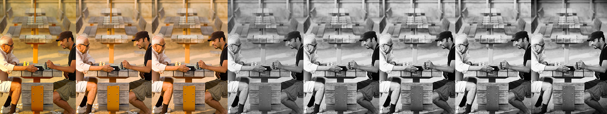
- Original JPEG
The JPEG straight out of the camera was way too warm, and a bit muddy. - Processed RAW
The RAW file was processed for white balance and a little bit of contrast to remove the haziness about it. - Touch-Ups
I used a non-destructive cloning layer to get rid of the stuff on the ground by their feet. - Black & White
I removed the color by using Photoshop's Black & White adjustment layer with 84% red, 32% yellow, 40% green, 60% cyan, 20% blue, and 80% magenta. - Curves Adjustment
Typical “S” curve for added contrast — maybe a little stronger than I usually use, but it works fine in this photo. - Contrast Blends
This one is subtle, but it's there. I stamped the visible image twice, applied a color burn layer blend to the first, and a color dodge layer blend to the second — both at 10% opacity and 100% fill. - Sharpening
Unsharp mask at 90%, 1.6 pixels, and a threshold of zero. - Vignette
I added the non-destructive vignette to bring attention away from the upper corners of the frame and down into the two men. I used an amount of -100 and a midpoint of +100.
Enjoy!
Katie
December 6, 2007Except the guy in white is wearing black socks, so he is secretly wishing to be on the dark side : ).
Brian Auer
December 6, 2007LOL, great observation! What do you think it means that the guy on the right isn’t wearing any socks at all?
Katie
December 6, 2007…his feet are hot?
Niels Henriksen
December 6, 2007In almost all my sharpening these days I use a technique which I can’t quite remember now) were I Stamp visible, twice or 2 smart layers if I think I need to edit.
I created 3 actions for light standard and heavy.
The large radius set to darken and the smaller to lighten. I also set the amount to high because it is easier to adjust the opacity later than reducing the Unsharp mask
Heavy
Darken: amount 270%, radius 2.2 threshold 2
Lighten amount 270% radius 1.3 threshold 2
Standard (only radius changes)
Darken radius 1.9
Lighten radius 1.1
Light
Darken radius 1.2
Lighten radius 0.7
I may even use the blend-if slider on the lighten to remove any blown highlights with a gradual change.
The action doses the twice stamp visible, naming the layers and the Unsharp mask settings.
Great fun to just press a button and watch it all happen..
I then tweak the opacity to my likening.
Sometimes I will also run and extra stamp visible to create what some call a reverse Unsharp mask
Amount 25%-40% ( first set at %500 to watch what happens with radius)
Radius 25-50
Threshold 0-2
This is only used for areas where there is light texture big grained texture like waves etc.
I then mask for just these parts.
I hope some of you find this useful.
Niels Henriksen
Brian Auer
December 6, 2007Wow, I’ll have to give that a shot! I like the idea of having an action setup for this.
Neil Galloway
December 6, 2007Great shot. I like how there bodies are only partially in the shot on each side, so it bring the focus on their game and themselves. Nothing to distract you. That is a great idea to show how you edited the photo and the steps along the way. I am going to make an effort to do that on my site as well.
Niels Henriksen
December 7, 2007As a follow-up to my comment on the sharpening method I would like to provide further clarification.
The darken layer must be above the lighten layer otherwise the lighten layer would cancel the effect of the darken layer.
The reason that the darken sharpening has a larger radius than the lighten, is due to visual perception of tonal changes. We perceive for a similar absolute tonal change in lighten effect more than we due for a darken effect. Therefore the darken needs a larger radius to have the same visual effect as the lighten.
You could in theory increase the amount of sharpening effect to a higher almost but this would darken lines which are not always what we want. Subtlety is key driver and if you can notice any effect, unless that was your motivation, then it is too strong.
On my web site have written and detailed article in PDF on the reverse USM sharpening (Colour to High Contrast B&W ) with good visual examples and an article on the Blend-If slider to control the Halo effect.
https://www.nielsp.ca/Ariticles.htm
Niels Henriksen
Dave Mac (Colour Void)
December 8, 2007Did you also notice that the “white” player is using the white chess pieces and vice versa? Very cool Brian!